9
Cogitating Vectors: The Hershey Fonts
9.1
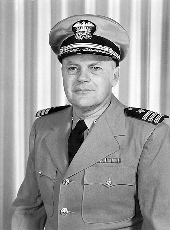
Allen Vincent Hershey, official portrait, 1961
This is the story of a pioneer of digital typography. He was one of the first digital typeface designers, and his work is still significant today. Yet, he is not well-known — this brief introduction shall help remember him and be a tribute to his achievements.
Allen Vincent Hershey was born in Kellogg, Idaho, on August 15th, 1910. In 1932, he received a bachelor of science in chemistry, in 1936 a masters degree, and in 1938 a doctorate in physics — all from UC Berkeley.
From 1938–9, he was employed as a research engineer for General Electric. After this, he spent almost his entire career as a civil service research scientist at the Naval Proving Ground in Dahlgren, VA, then known as U.S. Naval Weapons Laboratory.
It does not read like the typical career path for a typeface designer. Obviously, Hershey was a scientist. Part of his job were calculations of shapes and curves, such as the geometry of ship hulls, the propagation of frequencies under water, flight trajectories etc. Natural for a scientist, Hershey documented his work in papers and reports, using the tools of the time — typewriters. One example, such as the 1966 Measured Versus Computed Surface Wave Trains of a Rankine Ovoid (roughly 30 pages of text), makes it evident that documenting work in physics must have been a major undertaking. Almost every single page required multiple mathematical formulas (not short ones). Creative solutions were needed to type those formulas — one of them was a machine called Varityper. Resembling a typewriter, it allowed the insertion of plastic bits (called Typits) for typing special characters. Certainly, the process must have been cumbersome, and Hershey sought to improve it.
In August 1967, Hershey released a research paper entitled Calligraphy for Computers, in which he describes a possible concept of creating representations of letters using computer hardware. The abstract of the paper states:
The objective of the present investigation is to explore the feasibility of utilizing the computers and cathode ray printers at the Naval Weapons Laboratory for the preparation of mathematical reports.
The main goal of Hershey’s work was not designing typefaces. He tried to make his work less bothersome: Computers can be used for the saving of labor. To achieve that, he needed to demonstrate and test the possibility of using computers for typesetting, which was not common — especially for the 1960s.
It is clear that the Naval Weapons Laboratory was a well-funded operation. The NAVY was able to commission the Naval Ordnance Research Calculator (NORC) from IBM, a vacuum tube computer, which at the time was the fastest in the world. NORC was mainly used for arithmetic, relating to important matters like ballistics, satellite trajectories, etc. Quite difficult to imagine today, but of course the NORC had no screen — like any other computer of the time. To output data, it was common to resort to paper and line printers, which basically were big, automatic typewriters.
After line printers, progress brought along more sophisticated output technologies. NORC was equipped with a CRT Printer as well — a device that could emit data through a cathode ray tube. The tube itself was not visible — situated in a light-proof chamber. Light beams were responsible for projecting dots or vectors on the face of the tube. In a long exposure photograph, the light beam was recorded by a photographic camera, the result was a physical 35 mm negative. In the final step, this negative was used to expose and enlarge a positive image onto photo-sensitive paper. From today’s perspective, it sounds like a convoluted way for getting data on paper, but a meaningful graphical output from a machine that was only known for printing numbers must have felt like a miracle.
The specific CRT printer attached to NORC was a Stromberg-Carlson S‑C 4020. Marketing copy from an advertisement brochure for the machine illustrates the situation quite well:
Once upon a time, a company bought a large-scale digital computer. It was very useful but —alas!— expensive. It was hoped that all departments would benefit, but because the computer-printer generated only row after row of numbers and symbols, it was used only by the engineers. They took their armloads of papers to the drafting department, where an army of draftsmen and clerks converted the figures into charts, graphs and drawings. This was expensive and time‑consuming, and some charts were needed immediately. Then a bright engineer learned about a new kind of machine called the S‑C 4020 that takes the information from a computer and converts it into curves, graphs and pictures. And this machine keeps up with big computers because it prints with electron beams instead of a hammer and stylus. Of course, the S‑C 4020 prints words and numbers too, so they got one. The engineers talked about their versatile new machine, and soon other company departments were using it to solve their problems by transforming numbers into pictures form that everybody could understand and use. The controller used the S‑C 4020 to draw graphs and charts for his financial reports. The marketing manager produced sales maps. The production man used it for tool path drawings. The planning people used it to update critical path diagrams. And the S‑C 4020 saved space for everybody by storing all kinds of information on microfilm. (Naturally it prints paper copies, too.) If your computer has a usage barrier, learn how the S‑C 4020 can help it to talk in everybody’s language.
It is not an exaggeration to say that the S‑C 4020 represented a huge technological breakthrough.
Hershey was quite familiar with the S‑C 4020, some of his earlier work had revolved around mapping — a 1966 copy of the Laboratory Log (a small-audience newspaper at Dahlgren base) shows him holding a world map which was plotted with the aid of NORC in a few seconds. The text further states it is now possible to reconstruct maps by connecting the points of any automatic plotter which is under the control of a digital calculator. It is conceivable that the mapping project planted the seed for Hershey’s later work in type.
Calligraphy for Computers is a fascinating read. The paper is not only a technical document, but also introduces the reader to type terminology, takes detours into type history (East and West), computer science, and optics. The most delightful (and largest) section of the 250‑page volume is found in the appendices.
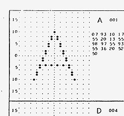
Appendix A “DIGITALIZATION WITH DOTS” 9.2 illustrates how a simple alphabet would look like as reproduced on the S-P 4010 dot plotter (precursor to the S-P 4020). The character set contains basic upper and lower case Latin and Greek alphabets, as well as a number of cartographic symbols — all bitmaps without any stroke contrast.
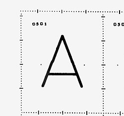
Appendix B, “DIGITALIZATION WITH VECTORS” 9.3 demonstrates how characters drawn by the S-P 4020 look like (the major improvement over the 4010 was added vector plotting capability). This section is significantly larger than the bitmap equivalent, which demonstrates that Hershey was clearly more excited about vectors. Various alphabets are shown, categorized for use in different sizes (p. 3):
Characters 9 raster units in height are available for FORTRAN or cartographic applications. Characters 13 raster units in height are available for indexical lines of print. Characters 21 raster units in height are available for principal lines of print.
9.2
A (detail), p. 57
9.3
A (detail), p. 84
The alphabets are really quite remarkable — not only was the notion of optical sizes very natural for Hershey, he also made use of the higher fidelity in larger sizes to create more refined drawings. The terms Simplex, Duplex and Triplex refer to the number of strokes used in parallel to build up a stem. While the Simplex alphabets have no contrast, the Duplex and Triplex series are inspired by the contrast model of a face like Century. The output examples Hershey demonstrated using the S-P 4020 were impressive: 9.4

9.4
Complete repertory of Hershey Fonts
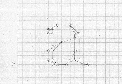
The report does not describe the process of “digitalizing” an alphabet. Despite the fact that the letter shapes are all based on pre‑existing models, the work involved must have been tremendous. Since the strokes created by the electron beam were fixed in thickness, (as was the coordinate grid), Hershey planned out letter details in a unique pattern of parallel and crossing lines. An original drawing 9.5 reveals that all characters were planned out on drafting paper, before the coordinates were (presumably) entered into FORTRAN code.
9.5
Lowercase (detail) constructed on drafting paper
Unifying the drawing method and the looks of loosely related type styles resulted in something like an early typographic superfamily — possibly even without intention. Hershey states (p. 4): The virtuosity of the cathode ray printer has been explored further with a number of calligraphic digitalizations. Indeed, there seems to be no other reason to digitize connected-script variations, and three different blackletter alphabets (perhaps he enjoyed this kind of work?)
Appendix C and D bring the multi-script explorations of the project to the next level — “DIGITALIZATION OF JAPANESE”. Complete sets of the syllabic Hiragana and Katakana are represented (digitized in Triplex mode), as well as over 800 Kanji ideographs. The “Lexicon of Japanese” (Appendix D) is a good addition, bridging the gap between Eastern and Western typesetting.
Calligraphy for Computers is impressive in many respects. The premise of the whole project is remarkable — saving labor, while improving typographic versatility at the same time. Hershey deserves credit because he did not try to solve this problem with an engineer’s mindset — his fonts are not geometric or overly simplified, he went to great lengths to articulate the artistic detail of the typefaces he digitized. The choice of high quality source materials certainly was a smart decision: to inform his selection of styles, he consulted type specimens from established type foundries (American Type Founders), referenced high-quality calligraphy and lettering manuals (Goudy, Tschichold, Weiß), and learned from established solutions, such as the LeRoy Lettering Set, a stencil-based lettering system for draftsmen.
The scope of the whole project is enormous. In spite of the energy it must have taken to complete it, it sadly concludes with a note that reads like a defeat (p. 27):
It can be concluded that the preparation of mathematical reports is almost within the reach of the latest cathode ray printer equipment. Almost. Testament to this is the fact that Calligraphy for Computers was obviously composed on a typewriter.
Technical progress however does not stop, and Dahlgren eventually replaced the S‑C 4020 with the successor unit 4060. With a smaller electron beam, it was able to work faster, in higher resolution. The 1969 report FORTRAN IV Programming for Cartography and Typography represents a triumph for Hershey — it concludes with the statement […] the present system can be used for the preparation of mathematical material — which is obvious, since the report itself is set in the author’s own type.
Today, the term Hershey Fonts mostly refers to the designs shown in Calligraphy for Computers, Appendix B. It is interesting to compare those to digital typefaces as we think of them today: their first appearance is manifested merely as the description of a concept.
Hershey cannot be credited alone for bringing typeface design to the computer. He acknowledges the work by Max Mathews, Carol Lochbaum and Judith A. Moss, 9.6 which used a very similar setup and approach at Bell Laboratories, and predicted the type designer of today in their 1967 paper Three Fonts of Computer Drawn Letters:
Eventually, to achieve high-quality fonts, type designers will have to […] learn enough computer technology to express their designs in this new digital language.
Hershey’s achievements are significant, since they represent one of the first attempts at drawing fonts with a vector, which (in a way) is still the method used today. We usually forget the fact that not only the letters had to be drawn, but a whole ecosystem had to be devised for them. Hershey deserves respect for focusing not only on the solution of a problem, but also for considering the aesthetic impact of his work.

9.6
Mathews, Lochbaum, Moss: Three Fonts of Computer-Drawn Letters, 1967
Personal life
Allen Vincent Hershey passed away in 2004 — too soon for me to know him or interact with him. However, I was lucky to get a very private insight into his life. Much background information was relayed to me by his daughter, Dorothy. In telephone conversations, she remembered her father’s personality, and described a man who was truly enjoying his work. She recalls playing in the garden with her father sitting beside her, thinking about mathematical problems. 9.7 Hershey’s position in General Research allowed him to work on projects he was truly interested in — and his superiors trusted his decisions. Dorothy emphasized that aesthetics were important for her father — she remembers him talking about the problems with different projection models of the globe, and his dissatisfaction with the NORC’s machine typography.
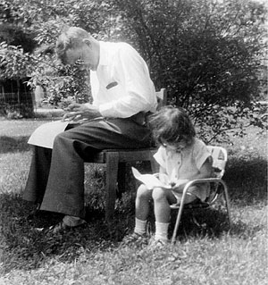
9.7
Father and daughter cogitating in the garden, 1950s
Digital restoration & considerations
The digital data of Hershey’s work has been released into the Public Domain, and now is found in various formats all over the internet. Many computer programmers have attempted different kinds of resurrections which are mostly focused on visually representing the data. This motivation has manifested in various self-serving viewer applications, straight‑to‑PDF conversions, web sites with images of the type, etc. As a graphic designer, I don’t feel this approach is satisfactory. After all, Hershey wanted his fonts to be used, not just to be looked at.
I have spent time on making Hershey’s work accessible for anyone using type today — as digital font files. Knowledge about the inner workings of digital typefaces allows me to create a successful conversion to the OpenType format; however, there are some aspects that need considering:
Unlike a typeface designer of today, who often works to fulfill perceived necessities, Hershey knew exactly what he was after when creating his alphabets. He (focusing on mathematical formulas) put emphasis on adding the Greek alphabet, rather than fleshing out language support beyond English. This makes the planning of a font release difficult. Should I work on a typeface that does not even allow me writing my own name? Is it reasonable to add new characters? Is the work supposed to be a historically accurate representation, or an interpretation? Another considerable influence is the reproduction hardware: the electron beam of Hershey’s output devices had one specific size, which makes the Duplex and Triplex glyphs appear to be filled in. A laser printer has much higher resolution, which makes letters appear with a skeleton‑like effect. In a digital font file, I can create vectors in all kinds of sizes. Which is the ideal stroke weight? Finally, I want to create great vector outlines, which cannot just be overlapped as light beams — I am still working on figuring out the math (and I am definitely not as good a mathematician as Hershey).
Modern interpretations
of Hershey’s work as digital typefaces
Today, two commercially available typefaces based on Hershey’s work exist.
Minotaur, Jean-Baptiste Levée’s interpretation, released on Production Type, is free of preconceptions. The digitization is faithful to Hershey’s ideas, yet clearly not historizing. Multiple weights (way beyond the ones provided in the original repertoire) round out the family, the Sans and an experimental style called Beef are free interpretations beyond Hershey’s original ideas. Lombardic capitals are a witty addition acknowledging Hershey’s pioneering work.
The MAD project by Dries Wiewauters recently released with Colophon denies any influence of Hershey. In a short 140‑character‑conversation, Wiewauters says his shapes were inspired by Autocad only (an application which embedded the Hershey fonts). While the focus on one specific software may count as an excuse, I think it is not only frivolous to close the eyes to history — it is also slightly sad to present a borrowed design aesthetic without any explanation.
Both interpretations add value to Hershey’s original idea — they increase the character set, take liberties in the design decisions and add today’s essentials like kerning and OpenType features. None of them interpret the full breadth of Hershey’s work — no Greek, no Cyrillic, let alone the Japanese characters are part of any of the interpretations.
Synopsis
Not everyone who designs typefaces has to be a typeface designer by trade. In fact, there are more people out there just trying to solve a problem with type — think of Donald Knuth. Knuth’s dissatisfaction with the phototype version of Monotype Modern led to him creating a completely new typeface format — Metafont (1979). Hershey was driven by aesthetics, and a desire to simplify practical matters — just like Donald Knuth. I believe Hershey’s contributions to digital type and typography deserve to be recognized. Through my resurrection of his work as digital type, I hope to contribute to the memory of a remarkable personality.
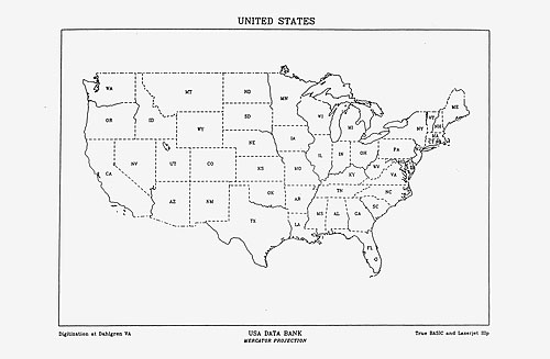
9.8
Digitization at Dahlgren VA, USA data bank (mercator projection),
True Basic and Laserjet IIIp
biography
Frank Grießhammer is a typeface designer from Germany, living in Oakland, CA. He is interested in digital type archeology, and is a founding member of the Zapf Dingbats Appreciation Society. He studied graphic design at HBKsaar in Germany, and at ISIA Firenze in Italy. He received a MA in Type & Media at KABK The Hague. After a short stint at FontShop International in Berlin, he has been working for the Adobe Type Team since 2011.
acknowledgements
Dorothy Donhauser for various telephone calls in which she recalled the private life of Dr. A.V. Hershey, Allen Donhauser for sharing photos of “Grandpa’s prints” and attending my lecture at SFPL, André Mora for proofreading this text and making good improvement suggestions, Tânia Raposo for support and encouragement, Jean-Baptiste Levée for (indirectly) helping me discover Hershey’s work and for generously lending the Minotaur fonts, The Computer History Museum for sending me the punched cards’ data for “Three Fonts of Computer-Drawn Letters”.
bibliography
Hershey, A.V., Calligraphy for Computers, Naval Weapons Laboratory Report 2101 (1967)
Hershey, A.V., FORTRAN IV Programming for Cartography and Typography, Naval Weapons Laboratory Technical Report TR‑2339 (1967)
Mathews M.V., Lochbaum, C., Moss, J.A., Three Fonts of Computer-drawn Letters, Communications of the ACM Vol. 10, No. 10. Alternatively: The Journal of Typographic Research Volume I, Number 4 (1967)
Hershey, A.V., The Plotting of Maps on a CRT Printer, Naval Weapons Laboratory Report 1844 (1963)
Patterson, Z., Peripheral vision: Bell Labs, the S‑C 4020, and the origins of computer art (Cambridge, Massachusetts: The MIT Press, 2015)
Ruggles, L., Letterform Design Systems (Amherst, Massachusetts: University of Massachusetts, 1983)
further reading
Béziers, Hershey & Lombardics — Minotaur
DIN A5 (21 × 15 cm), 96 pp.
softcover (first edition, 2017)
ISBN 979‑10‑93578‑05‑7 / PP0024 Published by Production Type
iconography credits
9.1 Dorothy Donhauser
9.2 Calligraphy for Computers
9.3 Ibid.
9.4 Frank Grießhammer
9.5 Dorothy Donhauser
9.6 Frank Grießhammer
9.7 Dorothy Donhauser
9.8 Ibid.
online version info
Originally published in issue B, 2017.